Contributing to the design system
Overview
When contributing components to the design system, keep in mind that the mental model is not that of a commercial component library. Because it is intended to be used across multiple applications with complex and specific requirements, we optimize for flexibility, granularity and favor composition rather than large and specialized "mega" components.
That focus on flexibility requires adherence to a few guidelines:
- Instead of designing for every possible scenario, we provide contracts and structures for composition.
- The application is responsible for determining how granular behavior and style should be; we provide the opportunity for specificity but don't enforce it.
- We do not use specific icons or svg components - that is a theming, application-level concern.
- While some defaults are inevitable, "out of the box" theming is counter-productive so defaults should be minimal and easily overridden.
Contribution Guidelines
The design system is expected to continue evolving as requirements and capabilities change. Changes and MRs are welcome and appreciated, as are suggestions and engagement in defining the roadmap. This guide will also evolve as more contributors take ownership and invest back into the design system, so please feel free to be your naturally opinionated self as we build this foundation together, and don't hesitate to point out opportunities for optimization or improvement.
When to contribute
If a component is being used in multiple locations and you are faced with the choice of copying or referencing that component, consider abstraction and build out of a design system component instead. It is very likely that other engineers will face that same choice in the future.
Additionally, while feature planning and execution are underway, if a component or set of components need to be built that might be be applicable across multiple applications or features, that could also be a good candidate. If there is no time or runway to invest in abstraction and build, consider adding the component to the roadmap for a future build out.
Opening an MR
This is the process for contribution:
- First, make sure that there isn't already a component or a component on the roadmap to avoid duplicating efforts.
- Create an issue and schedule a review to ensure design consistency standards. Designers and a dev from the technical steering committee will review the proposal.
- Once the requirements and the general design are settled, have fun! A TSC dev is available for questions or pairing.
Note: The PR will need review and approval by at least one TSC member in order to be merged.
Component File Elements and Export/Import
Each new component should be encapsulated in a folder named for that component inside the src/components folder. Each component should have, at a minimum:
- file that publishes the component --
my-component.tsx - Ladle story to demonstrate usage of relevant variants, props and styles --
my-component.stories.tsx - tests to ensure coverage --
my-component.test.tsx types.tsfile- exports in the root
my-component/index.tsfile decorated with the// __private-exportsso that it is not double imported when the index generation runs - exports in the root of the
src/componentsfolder, alphabetically listed - a theming example in the
.ladle/themefolder to demonstrate how the component might be themed for an application
Generate index barrel file
In order to keep the imports clean, all the components and their related configuration and types are exported at the root of the project. Therefore, when building a new component, once types are defined, run the following command to generate those exports at the root.
pnpm --filter=@accelint/design-system index
Ladle as development environment
Ladle provides a convenient platform in which to develop new components. It is very similar to Storybook but has better performance and is built on Vite. For the most part, Ladle is self-explanatory but there are a few gotchas:
- The
storyName,title, andmetavalues need to be serializable and also need to be unique. - Additionally, while the library provides hot module reload, it can sometimes fail to compile changes completely, so restarting can address that issue.
To run Ladle:
pnpm i

pnpm --filter=@accelint/design-system preview
If you choose to develop a new component outside of Ladle and then port it in later, you must also provide a Ladle story to demonstrate usage.
Building Concepts
In order to effectively build within the design system, we recommend familiarizing yourself with the essential concepts and architecture upon which it has been built. Core concepts.
Advanced Customization with Hooks
If the RAC don't work to meet a specific use case, there are other customized tools that allow for more granular control. While in general we prefer the approach of wrapping the React Aria components; however, for a highly customized component, it might be necessary to build on a different DOM structure or to blend functionality that might not be available otherwise.
React Aria publishes component-specific hooks that allow engineers to access the functionality of the components without the default DOM structure.
Additionally, React Stately publishes state-management hooks for managing state with a lot of precision. It is possible to combine approaches as well -- for example, using a combination of RAC and state hooks to architect the desired solution.
Core styles versus application theming
For any specific components, contracts and styles that are essential for the correct theming of that component should be co-located in the component folder. In general, the styles here should be as minimal as possible and contain no style definitions that would be better left to the application to determine. Instead, define the vars as a contract that will be later assigned as a part of implementation.
For example, in the component we might define a property that references the color as defined in a contract, which will only have a concrete CSS var assigned to it when the application theme is initialized.
button: style(
  {
    '@layer': {
      [layers.components.l1]: {
        color: buttonColorVars.color,
      }
    }
  }
);
Note that Vanilla Extract provides a utility for creating a fallBack var if one is not assigned, for example minWidth: fallbackVar(buttonSpaceVars.minWidth, 'auto').
Learn more about theming.
Layers
When we create a core style for a component, it is essential to assign it to a layer so that it has the correct precedence and can be overridden if necessary. If we miss this detail, then application engineers won't be able to theme the component correctly.
Learn more about layers.
Container queries
Container queries are an important concept when theming a component and allow for dynamic assignment of styles based on component state. It is critical to scope the component to a container correctly so that style assignments are appropriately instanced to the component being built and container queries executed as expected.
Learn more in depth about how to write container queries.
Anatomy/Architecture of a Component
It might be helpful to visualize the basic architecture of a component in the design system. This is a (very, very simplified) diagram that illustrates the essential concepts.
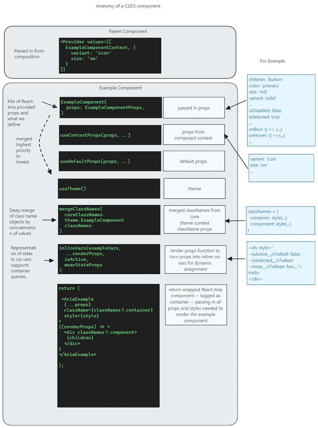
To review the diagram in Excalidraw instead.
Unit Testing
At a minimum, there should be a test that proves any new component renders without error. Ideally, there should be coverage with different props and usage scenarios. Code coverage must be 80% at a minimum or the build will fail.